amp-story 教學介紹-打造新視覺體驗的AMP故事

之前曾經介紹過AMP Story於2018年推出,而在 AMP conf 2019 上 AMP Story又有更進一步的進展,也許正式可使用AMP Story的日子將會越來越近了。
AMP Story的特色
首先要有一個概念是AMP Story :可以單獨成為一頁,不需要和某一個網址對應;而AMP Story同時有著獨特的排版標籤,無法應用於一般AMP頁面,因此兩者是分別不同的頁面,在一般的AMP網頁中無法於某一區塊放入amp-story,請將amp-story視為一個獨立的元件。
AMP Stories架構上是利用像圖層的概念一層層堆疊出畫面或動畫,有點像是以前做flash時疊圖層的概念(參考下圖),最右邊表示是最底層的物件,例如圖片(amp-img)、文字、影像(amp-video)等等,接著會用 amp-story-grid-layer(頁面中的圖層)將物件放在裡面,圖層可能會有很多個,端看如何排列; 圖層的外面又會包著amp-story-page(每一頁)的標籤,多個頁面最外層則是amp-story包住每一頁。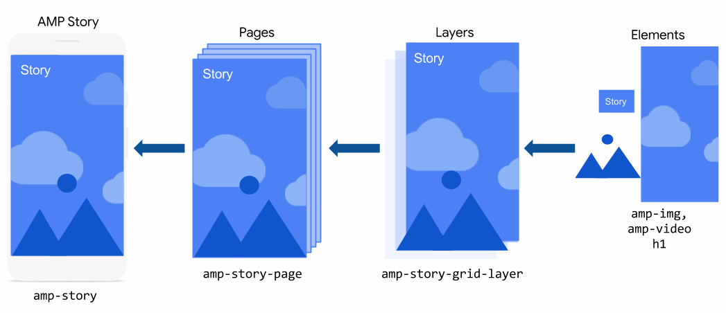
圖片來源:amp-story
以語法呈現的話會架構會如下圖所示,可以看到是用一層一層包起來的方式。
 圖片來源:amp-story
如何開始打造一份AMP Stotry?
一個完整的AMP Story範例:
| <!doctype html><html amp lang="en"> <head> <meta charset="utf-8"> <script async src="https://cdn.ampproject.org/v0.js"></script> <script async custom-element="amp-story" src="https://cdn.ampproject.org/v0/amp-story-1.0.js"></script> <title>Hello, amp-story</title> <link rel="canonical" href="http://example.ampproject.org/my-story.html" /> <meta name="viewport" content="width=device-width,minimum-scale=1,initial-scale=1"> <style amp-boilerplate>body{-webkit-animation:-amp-start 8s steps(1,end) 0s 1 normal both;-moz-animation:-amp-start 8s steps(1,end) 0s 1 normal both;-ms-animation:-amp-start 8s steps(1,end) 0s 1 normal both;animation:-amp-start 8s steps(1,end) 0s 1 normal both}@-webkit-keyframes -amp-start{from{visibility:hidden}to{visibility:visible}}@-moz-keyframes -amp-start{from{visibility:hidden}to{visibility:visible}}@-ms-keyframes -amp-start{from{visibility:hidden}to{visibility:visible}}@-o-keyframes -amp-start{from{visibility:hidden}to{visibility:visible}}@keyframes -amp-start{from{visibility:hidden}to{visibility:visible}}</style><noscript><style amp-boilerplate>body{-webkit-animation:none;-moz-animation:none;-ms-animation:none;animation:none}</style></noscript> </head> <body> <amp-story standalone> <amp-story-page id="my-first-page"> <amp-story-grid-layer template="fill"> <amp-img src="https://example.ampproject.org/helloworld/bg1.jpg" width="900" height="1600"> </amp-img> </amp-story-grid-layer> <amp-story-grid-layer template="vertical"> <h1>Hello, amp-story!</h1> </amp-story-grid-layer> </amp-story-page> <amp-story-page id="my-second-page"> <amp-story-grid-layer template="fill"> <amp-img src="https://example.ampproject.org/helloworld/bg2.gif" width="900" height="1600"> </amp-img> </amp-story-grid-layer> <amp-story-grid-layer template="vertical"> <h1>The End</h1> </amp-story-grid-layer> </amp-story-page> <amp-story-bookend src="bookendv1.json" layout="nodisplay"> </amp-story-bookend> </amp-story> </body></html> |
基本上頭部和原本的amp網頁沒有差多少,但載入的js不太一樣,以橘色標註的是amp-story裡面特別的語法,以下就這些語法做解釋。
【在head中】
<script async custom-element="amp-story" src="https://cdn.ampproject.org/v0/amp-story-1.0.js"></script>
amp-story的相關js檔案載入
<link rel="canonical" href="http://example.ampproject.org/my-story.html" />
指定連結的網址,但由於amp-story可自成一頁,建議連結網址連回自己就好,不需要特別連結到其他頁面
【在body中】
<amp-story standalone>
只能夠放在<body>底下,並且是唯一的子元素(所有內容都必須包在這裏面)
如果需要桌面滿版可以增加 supports-landscape 例如:<amp-story standalone supports-landscape>
<amp-story-page id="my-first-page">
每一頁的標籤,id一定要設定
<amp-story-grid-layer template="fill">
頁面裡的排版方式,template="fill" fill代表的是全滿版意思,template="vertical" vertical代表裡面元素從上道下排列。其他也有分成三等份區塊、由左至右排等等。
<amp-story-bookend src="bookendv1.json" layout="nodisplay">
</amp-story-bookend>
放在</amp-story>前面的語法,用意是在看完整個故事之後,出現一個頁尾結束的資訊,可在bookendv1.json 裡面放入想要連結的資訊。
欄位呈現有固定幾種方法
想製作一份amp-story 可以複製上述的範例語法來修改看看,或是下載官方的範例文件(內有包含圖片、json檔案,架構較完整)。
各元件的詳細解釋
<amp-story>
故事
包住整個amp story的外框,建議在這裡面要加上一些資訊,才能讓google更懂該篇amp story要做什麼
範例:
<amp-story
standalone
title="My Story"
publisher="The AMP Team"
publisher-logo-src="https://example.com/logo/1x1.png"
poster-portrait-src="https://example.com/my-story/poster/3x4.jpg"
poster-square-src="https://example.com/my-story/poster/1x1.jpg"
poster-landscape-src="https://example.com/my-story/poster/4x3.jpg"
background-audio="my.mp3">
<amp-story-page>[...]</amp-story-page>
<amp-story-page>[...]</amp-story-page>
<amp-story-page>[...]</amp-story-page>
<amp-story-bookend src="./related.json"></amp-story-bookend></amp-story>
standalone
必要,代表宣告以下是amp-story
title="My Story"
必要,故事標題
publisher="The AMP Team"
必要,出版團隊
publisher-logo-src="..."
必要,1X1寬高比的方形圖片,表示發布者的的logo小圖(範例上是36x36px)
poster-portrait-src="..."
必要,3x4寬高比的直式圖片,在故事加載之前顯示的圖像。通常可以是故事的第一個畫面,但也可以使用任何代表故事的圖像
但像是 poster-square-src (方形的故事加載圖片)、poster-landscape-src (4x3橫向故事加載圖片) 則是可以選擇看要不要使用
介紹完重要的amp-story後,接下來是各個頁面和排版該如何編寫
<amp-story-page>
頁面
此標籤代表的是要放入的每一頁內容
必須要設定id
如果有需要加入自動播放的話,可以增加 auto-advance-after
例如:
<amp-story-page id="tokyo" auto-advance-after="1s">
秒數代表的是該頁等待幾秒後往後播放
也可以放入音樂播放
例如:
<amp-story-page id="zurich" background-audio="./media/switzerland.mp3">
※但實測時如果放入背景音樂會導致檔案無法預覽,或是音樂無法播放問題
<amp-story-grid-layer>
排版
每一頁的排版方式,在一頁page裡面可能會有很多個<amp-story-grid-layer> ,
排版方式大致上可以分為fill 滿版、vertical 垂直排列 、 horizontal 橫軸排列、三等份區塊
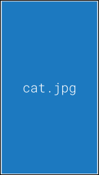
fill 滿版
圖片尺寸建議: 720x1280 或900x1600 16:9的圖片
假如希望在電腦版上出現橫向滿版,圖片尺寸建議1920x1280
 圖片來源:amp-story
範例
< amp-story-grid-layer template = “fill” >
< amp-img src = “cat.jpg” > </ amp-img > </ amp-story-grid-layer >
vertical 垂直排列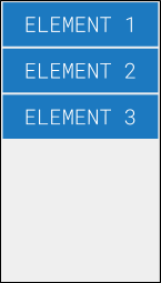 圖片來源:amp-story
範例
< amp-story-grid-layer template = “vertical” >
< p >元素1 </ p >
< p >元素2 </ p >
< p >元素3 </ p > </ amp-story-grid-layer >
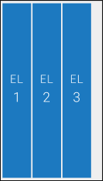
horizontal 橫軸排列
 圖片來源:amp-story
範例
< amp-story-grid-layer template = “horizontal” >
< p >元素1 </ p >
< p >元素2 </ p >
< p >元素3 </ p > </ amp-story-grid-layer >
thirds三等份區塊
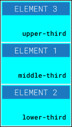 圖片來源:amp-story
範例
< amp-story-grid-layer template = “thirds” >
< p grid-area = “middle-third” >元素1 </ p >
< p grid-area = “lower-third” >元素2 </ p >
< p grid-area = “upper-third” >元素3 </ p > </ amp-story-grid-layer >
※.排版欄位的 grid-area="lower-third" ...之類的屬性在ios出現不支援的問題
而在這些排版標籤裡面也可以放入amp套件,但並不是全部都支援,詳請請見此說明
動畫效果
在這些元素上面可以加入一些既有的動畫效果:
例如
<h2 animate-in="fly-in-left" animate-in-duration="0.5s" >
Fly from left!
</h2>
animate-in="fly-in-left" 裡面填寫的就是效果名稱,例如這個是從左邊飛進來到定點
animate-in-duration="0.5s" 則是秒數
動畫效果一覽表
Bookend
在整個故事都看完後出現的選單畫面,可以分享到社群、更多相關資訊、連結等等...這些資訊可以寫在一個 json檔案裏面,再把json檔案放到 <amp-story-bookend>
語法範例
<amp-story standalone>
<amp-story-page id="cover">
...
</amp-story-page>
<!-- `layout=nodisplay` is required. -->
<amp-story-bookend src="bookendv1.json" layout=nodisplay>
</amp-story-bookend><amp-story>
* layout=nodisplay 為必要,請勿刪除
json檔案的寫法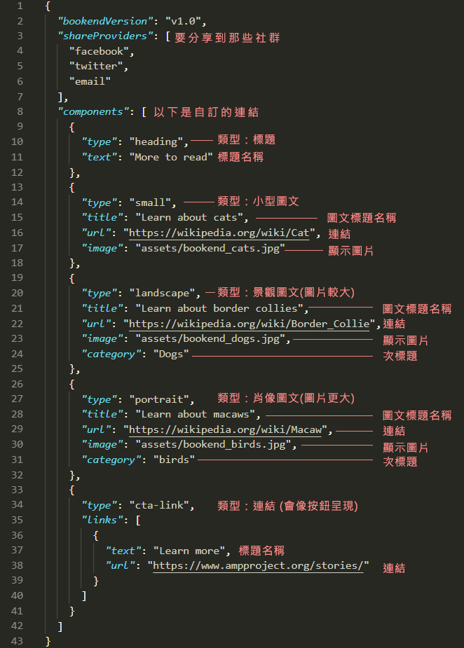
Bookend 各種出現形式,type裡面輸入不同屬性就可以有不一樣的輸入效果。
"type":" 在此輸入屬性"
heading
標題文字 圖片來源:amp-story
small
小型的圖文呈現,可設置連結、圖、標題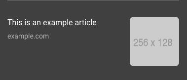 圖片來源:amp-story
landscape
以圖為主的呈現,可設置連結、圖、標題、次標題( category)
(圖片尺寸建議256x128px)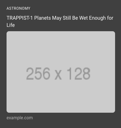 圖片來源:amp-story
portrait
更大的以圖為主的呈現,可以連結到其他story ,可設置連結、圖、標題、次標題(category)
(圖片尺寸建議312x416px)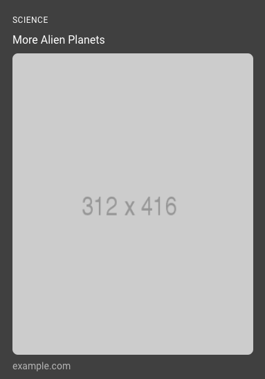 圖片來源:amp-story
cta-link
類似按鈕的連結形式,可填入連結和名稱。 圖片來源:amp-story
textbox
純文字說明欄,可用於版權宣告或頁尾說明
 圖片來源:amp-story
以上是AMP stories 製作的介紹,看下來似乎很繁複,但掌握到幾個大項要點後其實製作上並不難。
而目前AMP Stories也有幾套線上工具製作軟體,例如 https://ztorie.com/ 、 https://makestories.io/ 都可以使用看看
今年度 AMP conf 2019 時有公布了許多 AMP Stories 的未來進展,往後也會陸續介紹給大家。


台灣近年的認證的情況")


